Monday, April 9, 2012

Azure Valley Publishing

Hello All!

I have been commissioned to design 5 logos for a publishing company called TM Publishing. They have different category publishing names,, since they publish a wide variety of genres.
They are called:
Azure Valley: Fiction
Emerald Sky: Science Fiction & Fantasy
Burgundy Rain: Literacy
Amber Rain: Children's books
Crimson Fog: Mystery

I just finished the sketches and sent them off to the client. This what I told them.


A1. This one I am most excited about. I know that you do a lot of digital publishing and I wanted to take on the idea of a pop-up to compliment the interactivity you have with digital books. With this logo it can be modern with the sample of the origami or the multicolor. Clean crisp lines will make it pop as well as adding color. This also has potential for innovative business cards that have a simple pop-up in it and your clients will remember it. 

A2. Is also made for an origami style. I like the abstract of this logo a lot. It is made to be in the process of folding into a mountain (interactivity of origami), so the bottom half folds up. 

B1. This logo plays off of A1, where it is a silhouette of a pop-up mountain coming out of a book that creates a valley. We can play with the highlights in this logo and make interesting white shapes.

B2. Is similar to B1, however this one won't have any white shapes. We can really play with the shape of the mountain more and how the book opens.  This one is meant to be simple to fit with the modern look. (modern has 2 extremes one with gradients and one with simple shapes.)

C1. This mountain has potential to be either origami or just flat colors. I like that the mountain is coming out toward the viewer, so it has a 3D feel to it. 

C2. Is another one I like a lot. I like the idea of using 3 different sized triangles that actually create valleys within the logo itself. Again this can be either origami or flat color. 


Saturday, April 7, 2012

Tell Me Who I Am


I am way behind on updating this blog due to being busy with work and my freelance projects. (Irony? Maybe.) I received in the mail the other day the book Tell Me Who I Am by DeNae Handy. (Click the link and check out the interior layout I designed). I was super excited to see a design project of mine finished and published. I have to say that this was a huge learning experience when it came to learning InDesign, working with clients, and staying up late to make deadlines. I recommend reading the book.

Here is the synopsis: It "is a collection of stories and essays depicting faith, struggles, and universal experiences of 16 LDS writers. Told with humor and sensitivity, theses tales offer a glimpse into a religious culture that is alternately criticized, admires, and misunderstood. Self-reflective in tone Tell Me Who I Am will inspire and delight readers with its heart-wrenching, head-nodding, and often flat-out funny narratives (I, myself have laughed out loud, causing other's curiosity to wonder what is so funny.) While dogma may define people, this groundbreaking anthology shows how our individual stories ultimately tell us who we are."

Thursday, March 8, 2012

TM Publishing logo

These past 2 weeks I have been working on a new logo for the traditional and digital publishing house TM Publishing. These are the concepts I have submitted to the art director and I am currently waiting to hear back. The company wants a simple, progressive looking logo. If you ask me, that is quite vague. However, I did my best to figure out what exactly they want by playing 20 (10) questions. From there, I was able to get a more concrete idea of what they wanted. The owner said he liked the flag designs in the movie Kagemusha. He liked the simplicity and it described what they stand for and believe in. 

Now let's talk about my logo ideas:

1 A is an abstract of a book mixed with the feel of progression (arrows). 
1 B is with out the spine of the book to make the arrow more abstract. 
2 This logo is playing with the idea of a traditional book moving forward into digital copy.
3 A This is again playing with the idea of a digital book. Digital is something you can see but not really touch (similar to an illusion.) I also like how it switches view (one with the text at the bottom and one with the text on the outside).
3 B  is a simplified version of 3 A, referring to digital as well as to print.  I used the two key stokes [ ] and added lines for the text. Although, I worry about it being too simple.

I would love to hear any comments from you!


Sunday, February 12, 2012

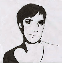
Sketch of a Woman

Today's post is simple, but I am excited about it because I got the exact likeness of my subject in this portrait.

Wednesday, February 8, 2012

Threadless design

I am braving the threadless.com community by submitting a little design I did for an infant onesie. It is currently getting approved and hopefully tomorrow people can start voting for it. If you like it, click this link or the one off to the side to vote for it. I plan on making more t-shirt designs in the future (because they are so fun to make. I recommend it!)


Wednesday, January 25, 2012

The Reeds Center

I finished The Reeds Center logo last night and sent it out today to the client! It feels really good to finish a project and the client is happy with your work. The logo has changed slightly since the last post. The client wanted all the words in the name to be the same size rather than the "The" be half the size of the title. I am excited to have another freelance job finished and will be starting on a website layout for a music company for children.

Monday, January 23, 2012

Little Sketches

This week I am posting some sketches (chronologically) that I have done in my little sketchbook. Enjoy!