Sunday, June 9, 2013

Letters to Sarah


I have been writing letters to my sister Sarah while she is on an LDS mission. She will be going to Kobe, Japan and currently she is in Provo, Utah at the Missionary Training Center learning Japanese. 
I have been writing her a letter every week and illustrating her a card or doing fun typography. 
I decided that I would like to start posting my cards for everyone to see. Who knows, I might even set up an Etsy shop and start selling cards. 

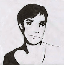
This sketch was inspired by the Russian artist Olga Gamynina


Thursday, June 6, 2013

Business Cards for Basic Gear


If you all remember, I made a logo for the company Basic Gear. My client came back and asked for business cards. It was very exciting for me, since it was the first time I got to design a business card (yes, I am still new to all of this).
I wanted to make a bridge between the outdoor (camping, hiking, rock climbing, bush whacking, etc.) and a clean modern look. So I took a wood texture (if I had a bigger budget I would get actual wood and brand the cards) and used that as the background. Then I took elements from their website to make a transition from web to print for the graphic elements on the back of the card.
With this experience I have learned a lot about making a design simple and not boring. I absolutely loved this project and can't wait for the next.

Thursday, January 10, 2013

El Mustacho :{)


This Christmas I decided to paint my sister something instead of going out and buying something. I looked around on her pinboards on Pinterest and she has a whole board dedicated to mustaches. Then I saw a pin that said "I mustache you a question" and I was inspired. This was my first hand lettering project and I must say I am pretty happy with it.  I have to say, my sister was ecstatic when she got it.

Process:

I first drew it on to a masonite board with gesso and scanned it into the computer. (I didn't like the way it turned out so I decided to try a different method rather than drawing and painting.)


I did a rough trace in Illustrator because I was going to be painting over it anyway and then printed it mirror image.

I then layered more gesso onto a masonite board and laid the print out on the board so the ink would transfer. Once the ink was transfered I scrubbed off the paper and then painted over the image.

The reason why I painted rather than make a print from Illustrator, was to practice my craftsmanship and mainly because I love the texture paint has and the character it adds to the piece.


Saturday, December 29, 2012

New Scanner


Santa brought me a high res. Epson scanner this year and I love it! It goes up past 1000 dpi. Now I can scan my art now and not worry about pixelated images. Here is my first scan of a sketch I did recently with no photoshop tweaking:


Wednesday, December 19, 2012

Basic Gear logo

I am excited to say that I am finished with the Basic Gear (outfitter company) logo! To continue off my previous post, my client chose the bear, which surprised me because he originally wanted a landscape. I was excited that he wanted the bear since I love drawing animals. I told him that the reason I chose a bear out of all the woodland creatures is because it is the most confident, resilient, and powerful out of the forest animals.

The previous bear sketch was too stagnant for my liking and I wanted to reflect that the company was always moving forward so I drew this sketch:

Then I traced it in Illustrator and added the company name and tagline as requested by my client. When I finished I realized how awkward the bear looked like floating on an implied hill, so I rotated him to be on a flat surface.  


I then got to play with color combinations and while I was thinking of color I wanted to keep it earthy  to keep it appropriate for an outdoor supply company. I researched earthy color palates and I found this one particularly helpful.


I took some of these colors and applied them to my logo:


I sent my client these 4 color options and he (and I) liked the chocolate brown bear the best. It is warm and earthy without being dull. From there, I saved multiple options of file types and made a style guide on how to use the logo properly. I quickly learned from my last client that if I skip the style guide my logos and all my hard work goes into the gutter. So learn from my experience, don't forget if you are making a logo to take the extra time to make a style guide or your vision for that logo (might) go to waste!


Sunday, December 9, 2012

New Year's Resolution/Alphabet

I have realized I am not the best of art bloggers recently (thanks to Pinterest for letting me know that). I am inconsistent with blog posts and my New Year's resolution is to post something at least every 2 weeks. So something I have been working on is an alphabet for kiddos and basically every letter is formed by an animal that starts with those letters. Here are sketches of the first 3 letters:


Wednesday, November 7, 2012

Basic Gear Redesign

After finishing the TM Publishing logos I was ready for a breather, however fate had a different plan for me. My new client Dave stumbled upon my blog while looking for someone to redesign his current logo.


Dave is a one-man show living in the Netherlands who sells outdoor gear. So far he has outfitted expeditions to Mount Blanc, Kilimanjaro, and the North Pole.

Dave told me he wanted to keep the landscape concept and if I wanted to I could explore wild animal logo concepts. I began sketching and I realized how difficult this was (is). I need to make a logo appealing to an audience that is made up of mostly 20-45 year old men, who are tough, and survive in the wild.

Here are some sketches that I came up with and sent my client this evening. I would love any feedback from you.