Saturday, December 29, 2012

New Scanner


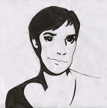
Santa brought me a high res. Epson scanner this year and I love it! It goes up past 1000 dpi. Now I can scan my art now and not worry about pixelated images. Here is my first scan of a sketch I did recently with no photoshop tweaking:


Wednesday, December 19, 2012

Basic Gear logo

I am excited to say that I am finished with the Basic Gear (outfitter company) logo! To continue off my previous post, my client chose the bear, which surprised me because he originally wanted a landscape. I was excited that he wanted the bear since I love drawing animals. I told him that the reason I chose a bear out of all the woodland creatures is because it is the most confident, resilient, and powerful out of the forest animals.

The previous bear sketch was too stagnant for my liking and I wanted to reflect that the company was always moving forward so I drew this sketch:

Then I traced it in Illustrator and added the company name and tagline as requested by my client. When I finished I realized how awkward the bear looked like floating on an implied hill, so I rotated him to be on a flat surface.  


I then got to play with color combinations and while I was thinking of color I wanted to keep it earthy  to keep it appropriate for an outdoor supply company. I researched earthy color palates and I found this one particularly helpful.


I took some of these colors and applied them to my logo:


I sent my client these 4 color options and he (and I) liked the chocolate brown bear the best. It is warm and earthy without being dull. From there, I saved multiple options of file types and made a style guide on how to use the logo properly. I quickly learned from my last client that if I skip the style guide my logos and all my hard work goes into the gutter. So learn from my experience, don't forget if you are making a logo to take the extra time to make a style guide or your vision for that logo (might) go to waste!


Sunday, December 9, 2012

New Year's Resolution/Alphabet

I have realized I am not the best of art bloggers recently (thanks to Pinterest for letting me know that). I am inconsistent with blog posts and my New Year's resolution is to post something at least every 2 weeks. So something I have been working on is an alphabet for kiddos and basically every letter is formed by an animal that starts with those letters. Here are sketches of the first 3 letters:


Wednesday, November 7, 2012

Basic Gear Redesign

After finishing the TM Publishing logos I was ready for a breather, however fate had a different plan for me. My new client Dave stumbled upon my blog while looking for someone to redesign his current logo.


Dave is a one-man show living in the Netherlands who sells outdoor gear. So far he has outfitted expeditions to Mount Blanc, Kilimanjaro, and the North Pole.

Dave told me he wanted to keep the landscape concept and if I wanted to I could explore wild animal logo concepts. I began sketching and I realized how difficult this was (is). I need to make a logo appealing to an audience that is made up of mostly 20-45 year old men, who are tough, and survive in the wild.

Here are some sketches that I came up with and sent my client this evening. I would love any feedback from you.


Saturday, September 1, 2012

Crimson Fog


I am excited to say that this is the final imprint logo for TM Publishing called Crimson Fog. This logo is for the genre mystery and thriller publications. This logo went through many variations before coming to the final that you see above. 

I researched all sorts of things from fog to blood splatters. Here are some images that inspired me:


Then I went to my sketchbook and drew a lot and here are the few that I sent to my client:


From my previous logos I felt that it was appropriate to go with something literal for the logo with some concept thrown in. My client liked B the best and felt that A and E were too dark for their liking. From their feedback, I made these more refined sketches:

My client liked the bottom cloud the best and felt that inorder to be a fog it needs some context. So for the mystery element, I decided to add a detective into the scene.


 My client liked B and D, however they didn't want the gender of the detective to be apparent, so I tweaked the figure by lengthening the trench coat and lowering the heels. After a few revisions, the cloud was taken out of the logo because of it's complexity. I looked up how I could make the figure appear to be in a fog. I found that fog is the absence of (in this case) a figure. I applied a gradient to the figure to make her/him appear to be in a fog.


Wednesday, August 8, 2012

Amber Ocean

This is the 4th out of 5 imprint logos for TM Publishing called Amber Ocean. This logo is for children's books so when I was researching I looked up the top 10 logos for kids and they were very colorful, playful, sometimes hand-drawn and just plain fun. 

After researching those logos, I searched to see what logos were out there already with wave or ocean theme. Below are the top three that I was influenced by. 


Again, I had to be literal about the ocean, but I noticed that the waves resemble book pages in a way. Below are my sketches I came up with. A, B, and D are pretty literal waves, while C, E, and F resemble pages in a book turning.
My client liked D the best and one the first round (a miracle) he liked it. All I had to do was tweak some more to refine the smooth edges and I was finished.


Friday, August 3, 2012

Burgundy Grove

Burgundy Grove is my 3rd out of 5 logos I am working on for TM Publishing. This branch is the Literary and Contemporary genre. (Emily Dickinson to the new American Dervish novel) My client wanted a pretty literal representation of their imprint brand.

In my sketch phase I wanted to have a visual metaphor of poetry represented in the trees. I wanted the trunk to be fluid and elegant. I also played with the style of leaves including blocked shape, variety in line width and individual leaves. I presented the following sketches to my client.


The client liked the 2nd one down on the left the best, because the trees where becoming one, he also likes the leaves on the top right tree and finally the trunk on the 2nd down to the right. I went back to the sketch book and came up with the following drawing (one of many) and my client liked it.


I then brought the following drawings into the computer and cleaned them up in Illustrator.


In all of these trees I wanted to portray grace and elegance as well as exploring different leafy top options. My client liked "A" the best and I refined the symbol further and added color. From my previous comp I fixed the line width of the trees leaves to flow better. I also condensed the trunks to become more of a solid shape as well as thickening the braches so you can see it when printed small on a book spine.